Scope of Work
DISCOVERY
Product Usage Analytics
User Research
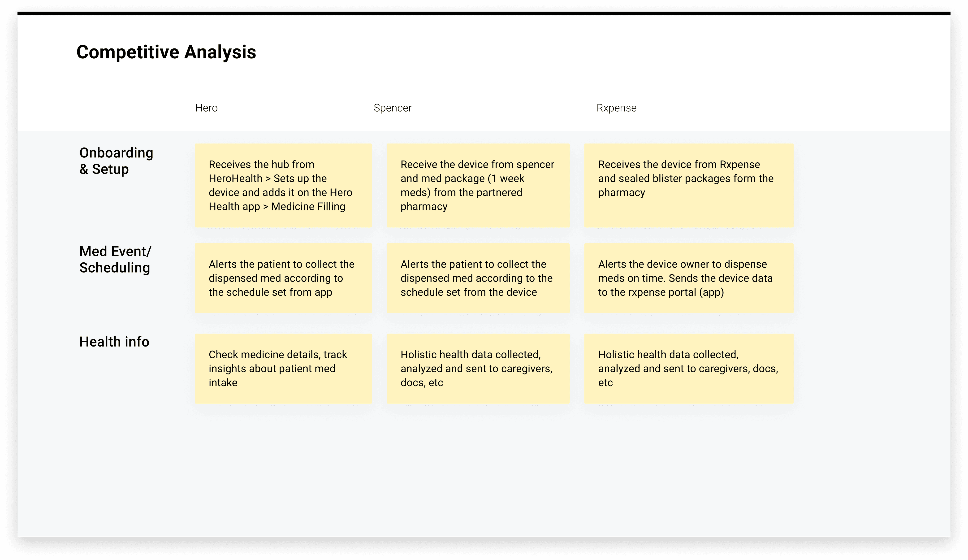
Competitive Analysis
Market Research
IDEATION
Brainstorming Workshops
Strategy
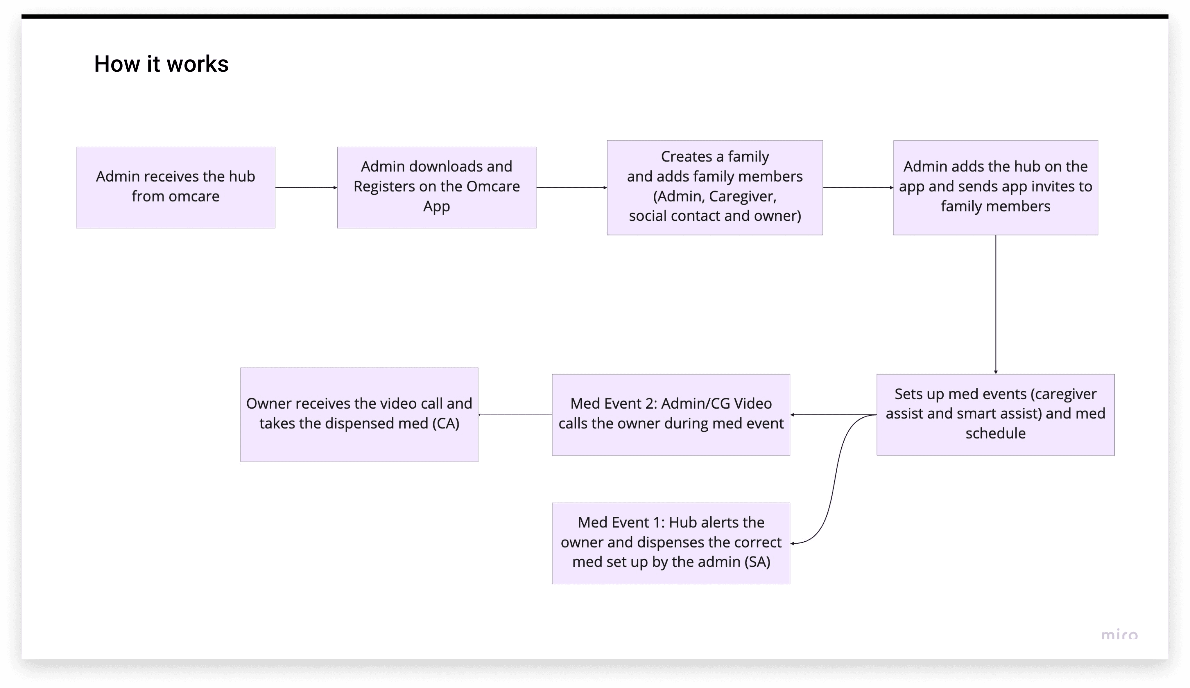
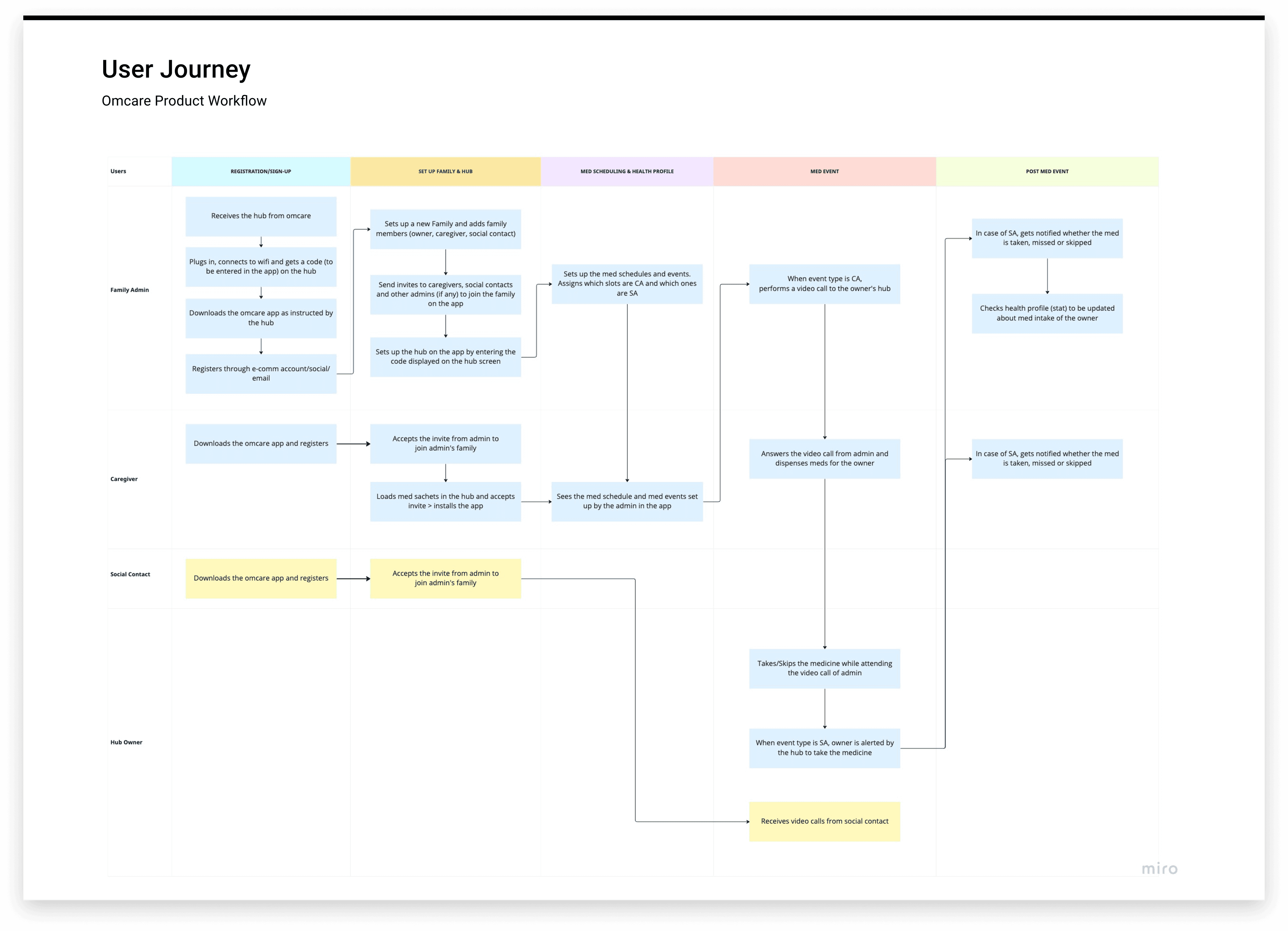
User Journey
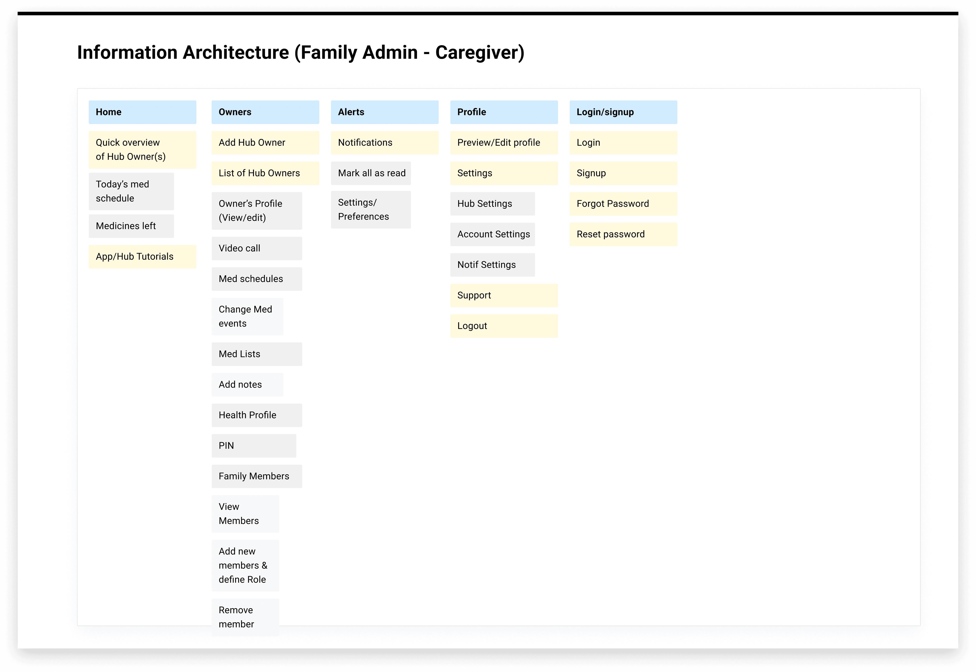
Information Architecture
Wireframing
Prototyping
DESIGN
UX Design
UI Design
Visual Language
Design System
Prototyping
Usability Testing
Goal
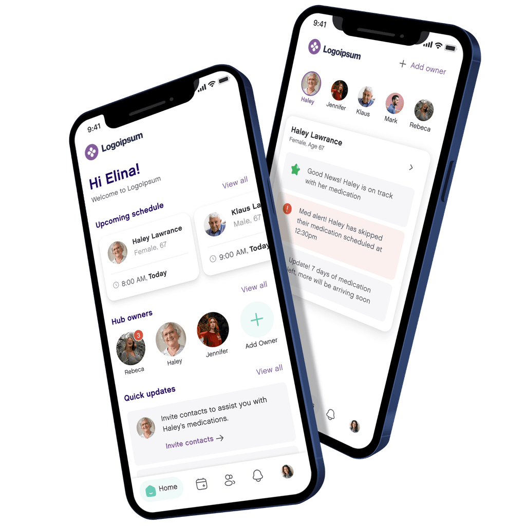
Taking remote care to the next level
The client offered all-in-one home telehealth solution that enables remote care and ensures the right medication at the right time for aging loved ones. Their ecosystem consists of a medicine dispenser and a mobile application which is used to set up the med dispensing schedule for the elderly.
Our goal was to change how home health care is delivered by building a seamless application while also helping the business to generate revenue through improving in-home health experiences
Imagine multiple caregivers seamlessly collaborating to provide personalized remote care. That's the reality we helped them create with their telehealth solution. By prioritizing an intuitive user experience and robust development, we ensured building solutions that are rooted in empathy and functionality.
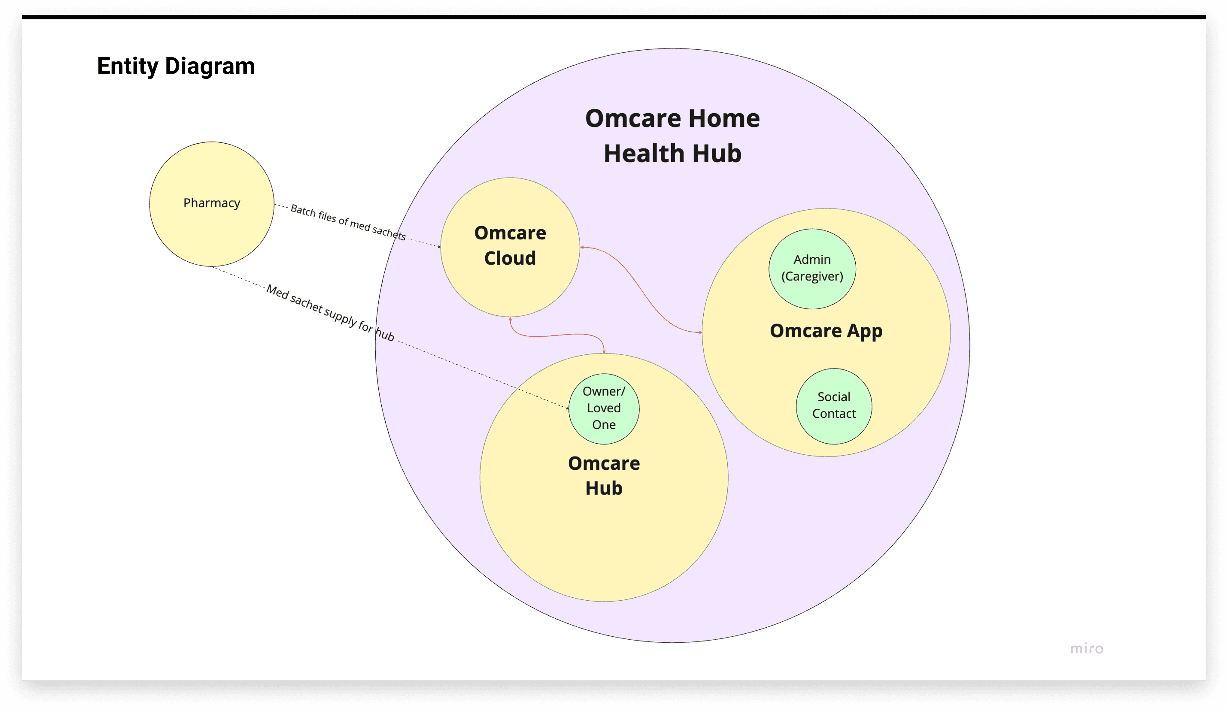
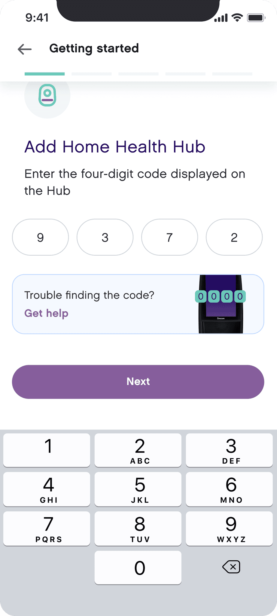
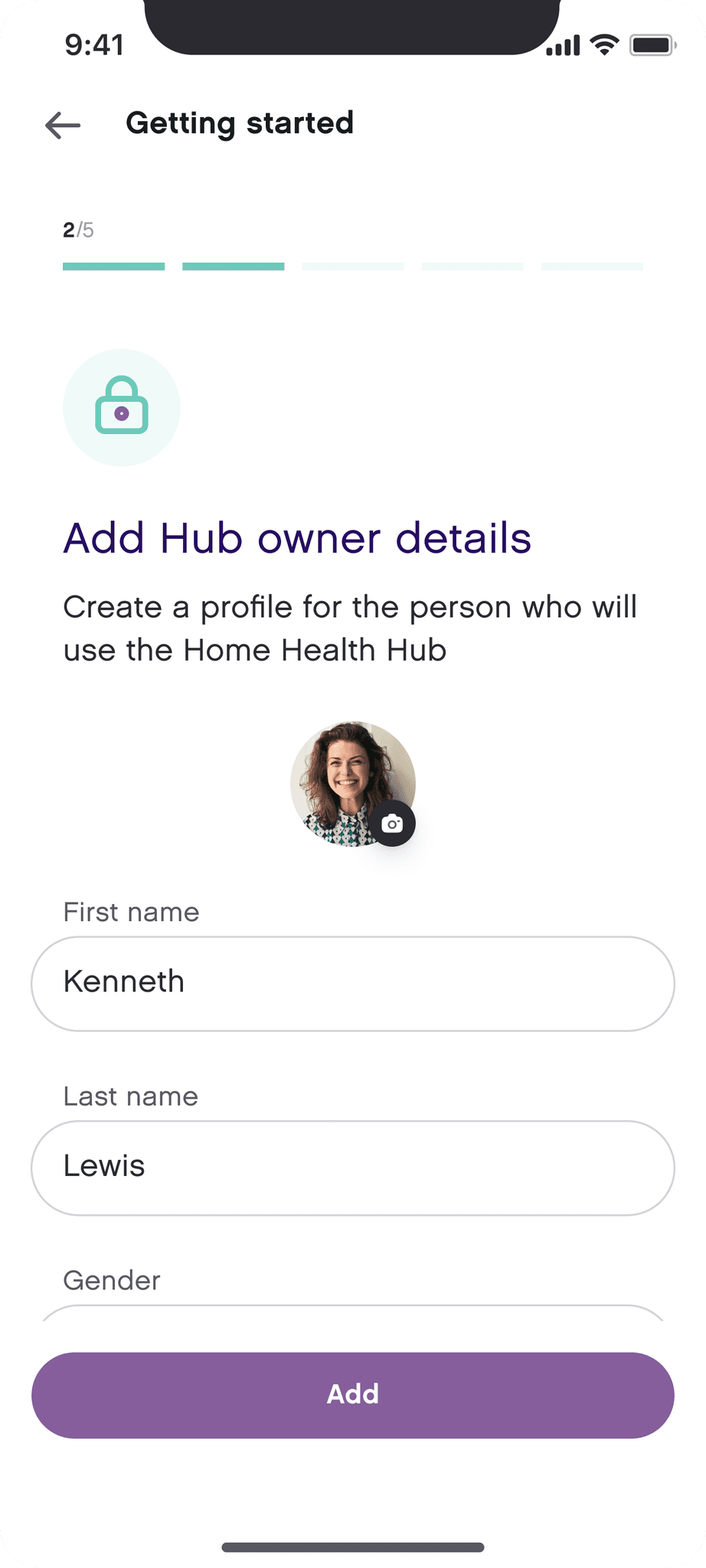
Understanding the Device and App Ecosystem and Establishing Ground Rules
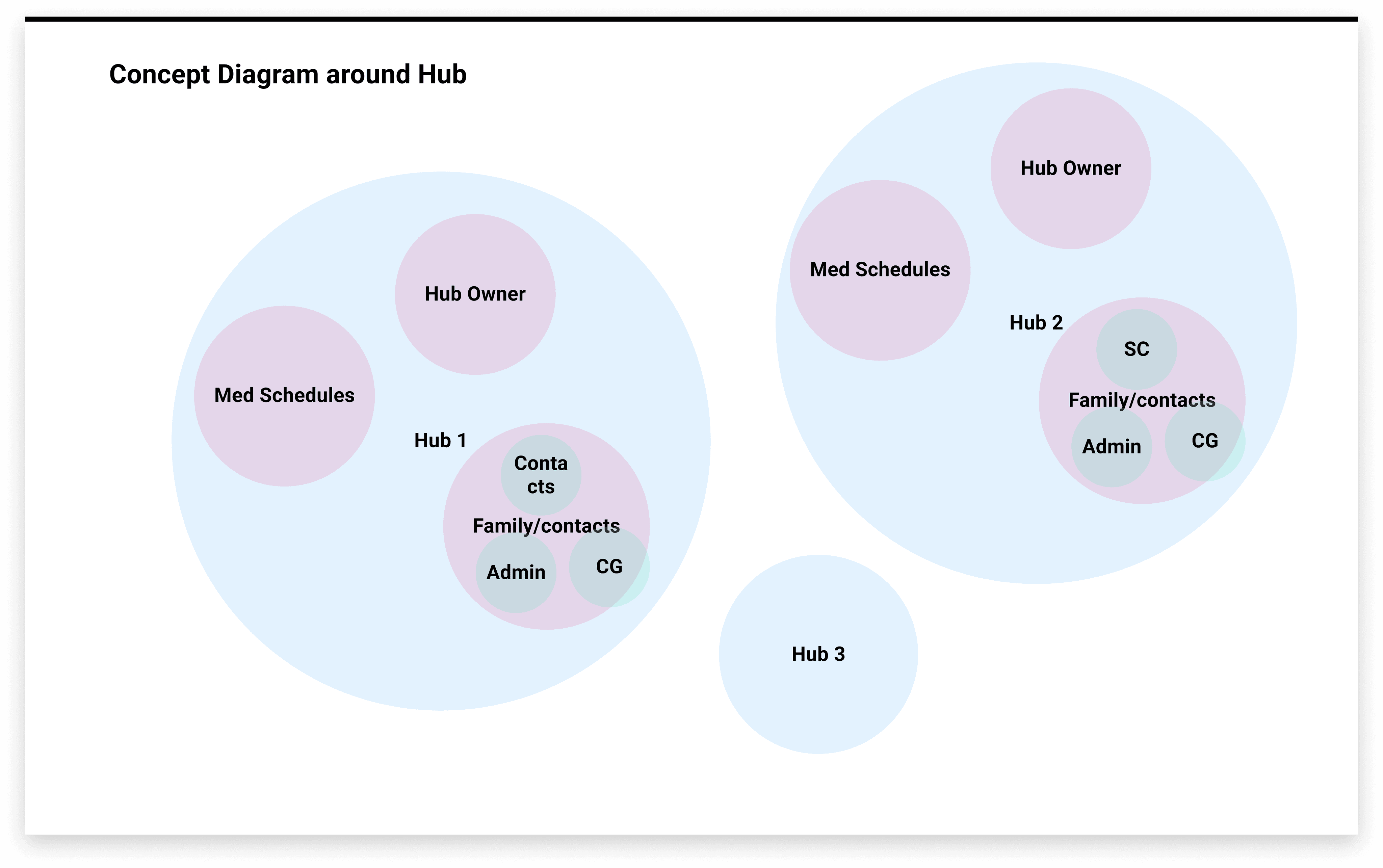
Considering the functionalities and limitations of the medicine dispensing device, we brainstormed and ideated on the core features of the app while also coming up with user roles and access for different sets of users who would be using the app - Hub owner, Admin, Caregiver & Social Contact.
We also conducted a competitive analysis of possible direct and indirect competitors to understand the gaps they offer and how can we cater to those gaps to stay ahead in the market.
Laying out the Information Architecture and Ideating Important Workflows
After the foundational research was done we had a base set, so we dived deeper into the core features and navigation of the app. We took reference from the existing web-app and the competitors to come up with highly simplified and optimised navigation and userflows, making sure that the tasks most prominent user tasks are intuitive and quick. Keeping in mind the mental model of our target audience, we came up with workflows that had a steep learning curve. What followed were some low-fi wireframes to get the ball rolling.
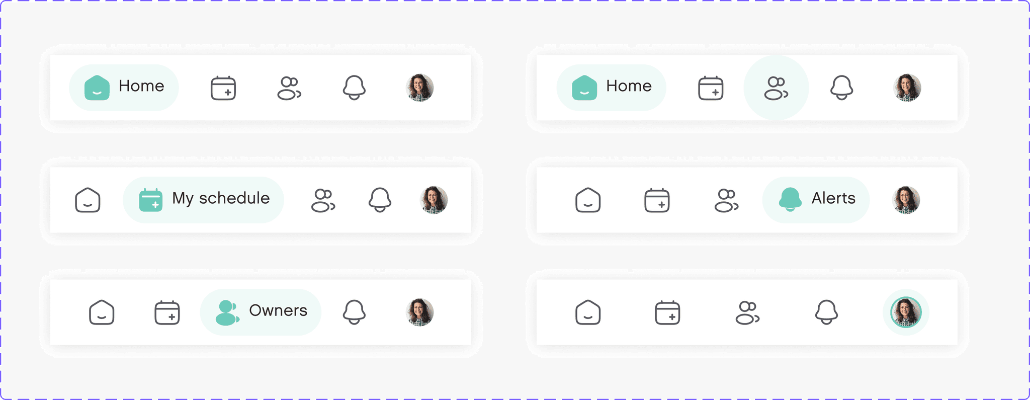
Standardizing UI Assets: Creating a Scalable Design System
After figuring out the information architecture, initial workflows and wireframes, we started working on the visual language for the app considering the brand persona and guidelines. We set up a scalable design system by adding a color library, text styles and also creating resusable components and patterns which would help us create a consistence visual experience throughout the app.
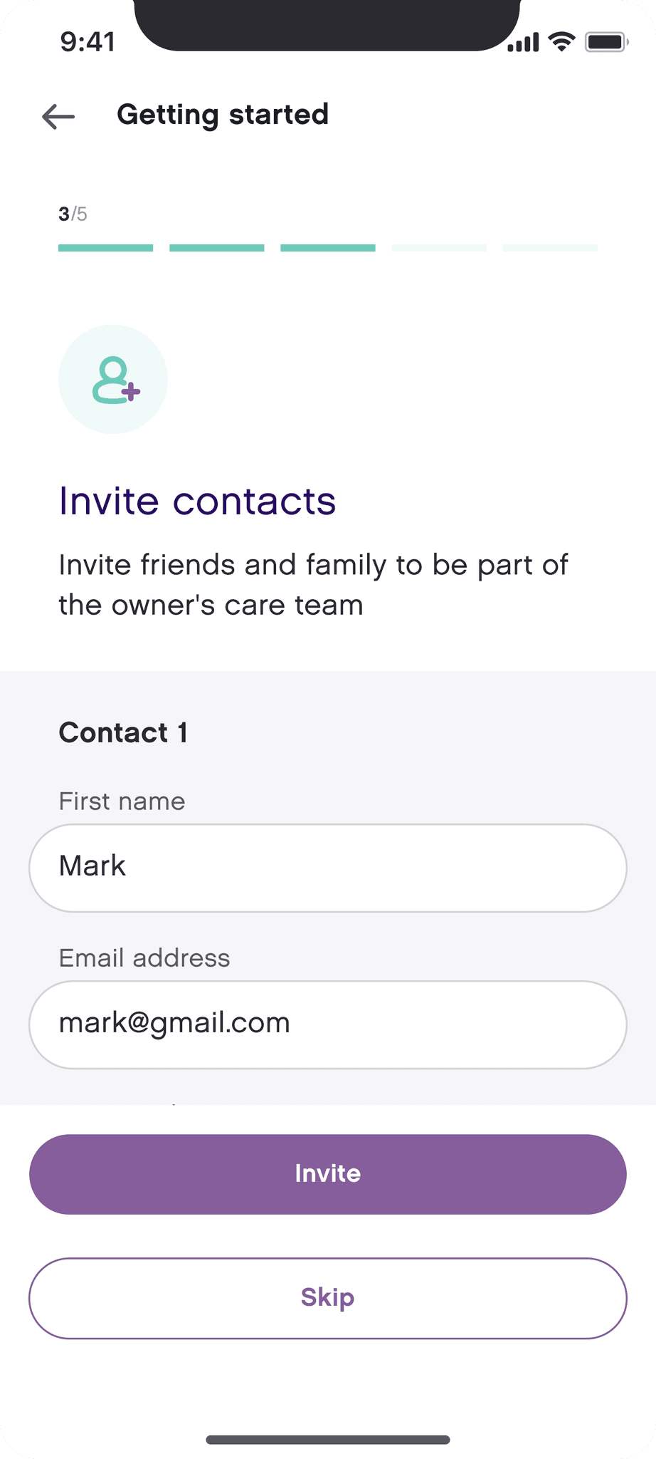
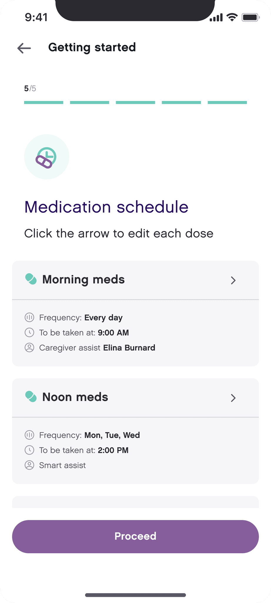
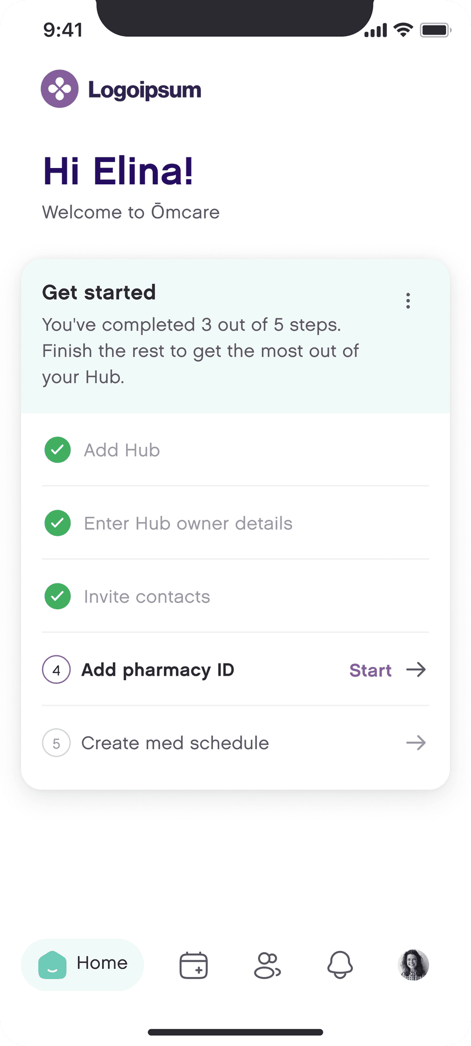
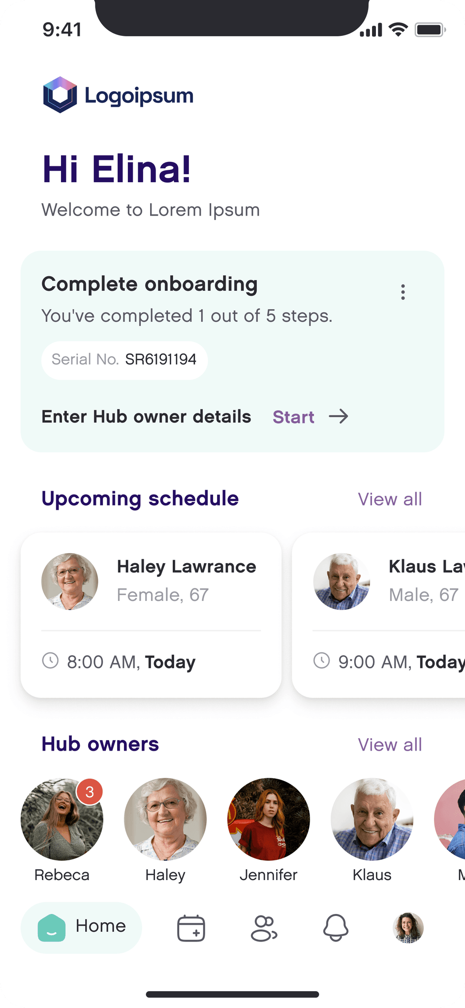
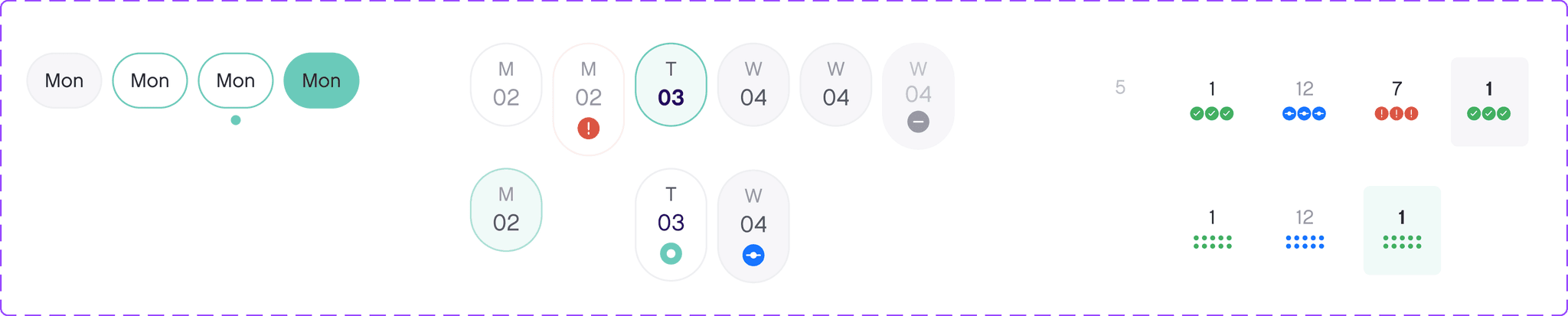
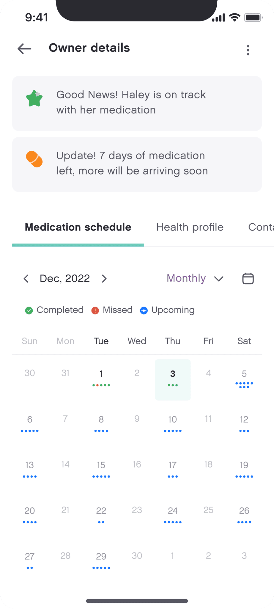
Enabling Flexible Medication Scheduling
Schedule for elderly: Different medications bring in various complexities regarding the frequency and time of the dose. We provided a flexible way to customize the schedule for every dose. The user can choose to set up different timings for different days of the same dose. The calendar view provides an overview of how the week/month looks like for the elderly by showing visual cues about the no. of doses available for each day
Schedule for caregiver: As a caregiver you can be managing a lot patients, specially in a B2B usecase wherein a professional caregiver’s could be managing 10 patients at one time. Keeping this in mind, we simplified the experience of a caregiver by providing a ‘my schedule’ section in the app where the caregivers can get a view of how their day looks like. This would help in keeping them up-to-date regarding their upcoming tasks
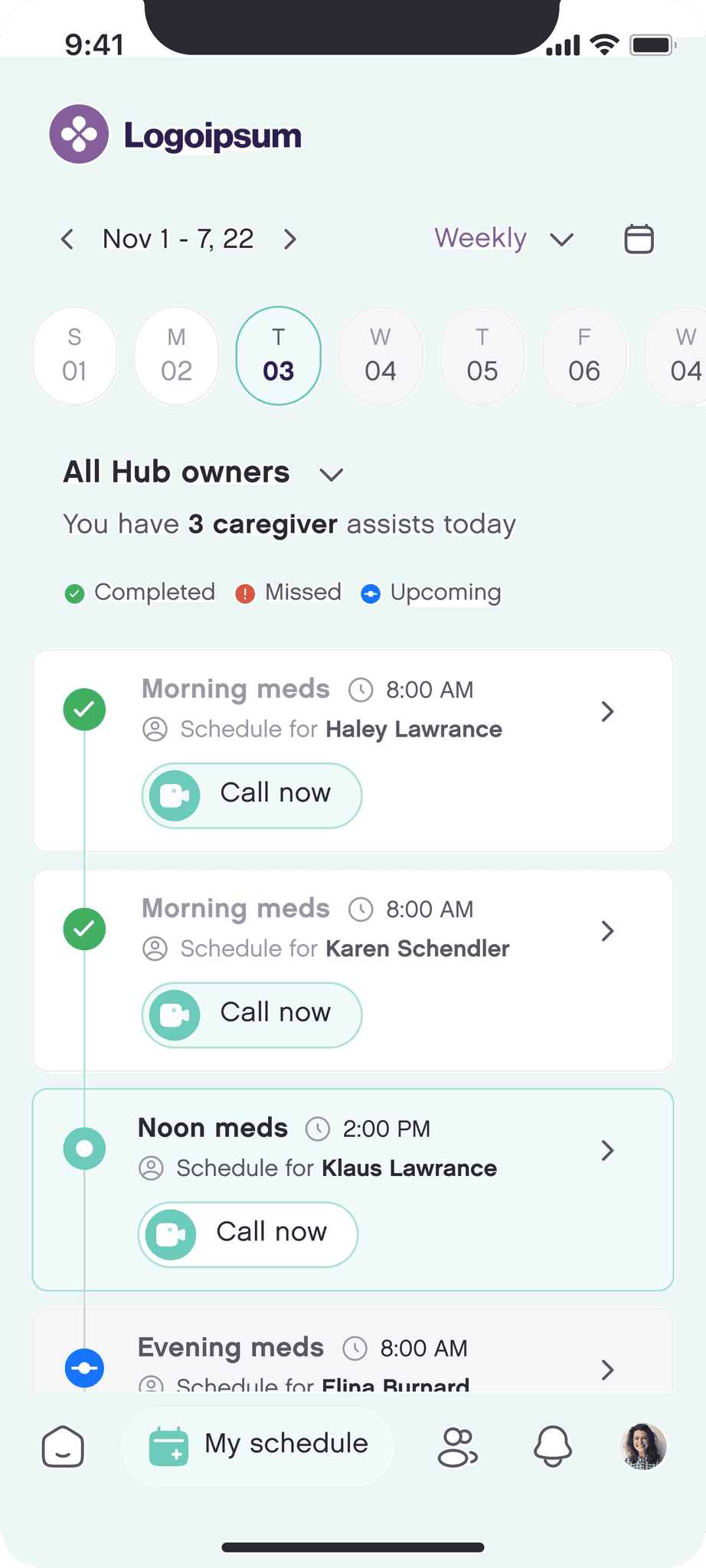
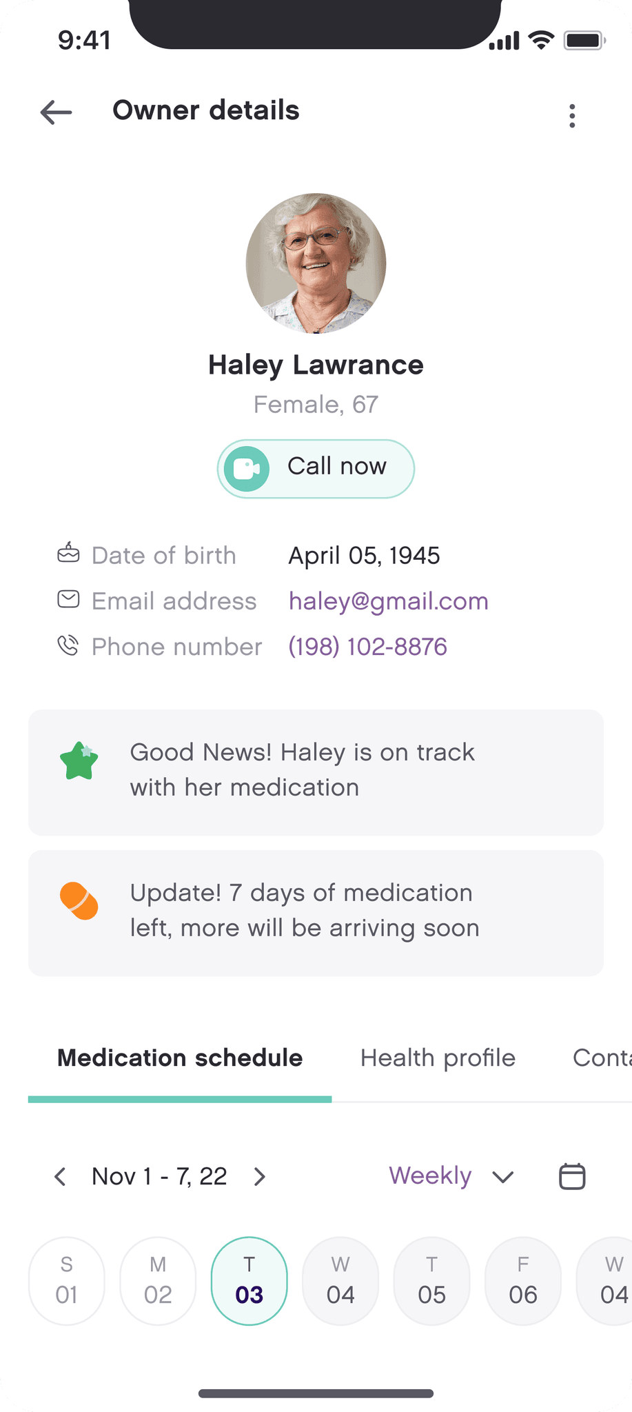
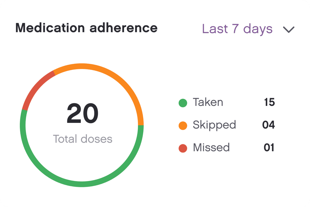
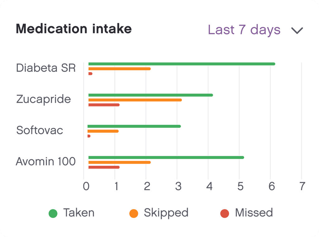
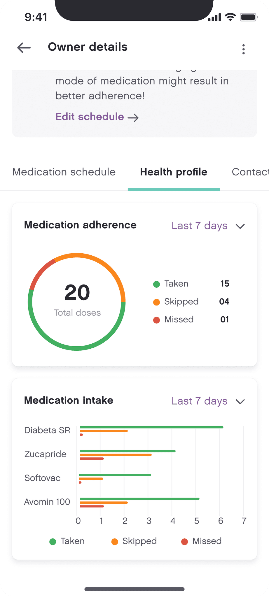
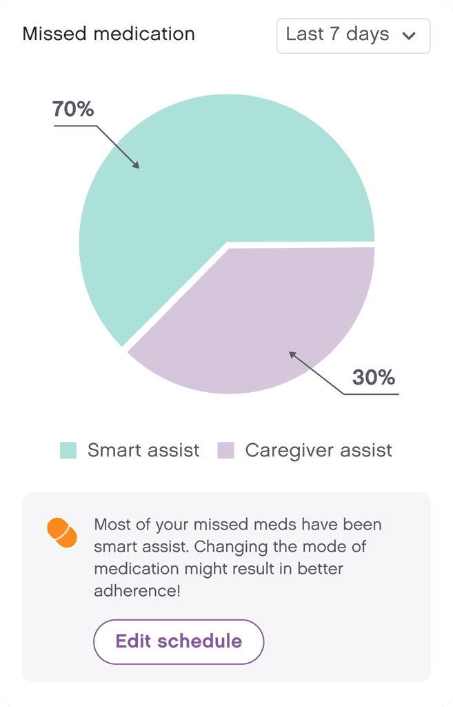
Providing a comprehensive view of the elderly's health and medication intake
We came up with a way to highlight adherence stats which would help the caregiver to keep a track of the medication intake of the elderly. The aim here was to not limit ourselves to designing just a medication reminder app by digging deeper and extracting meaningful insights from the data available which would help in understanding the overall health of the elderly
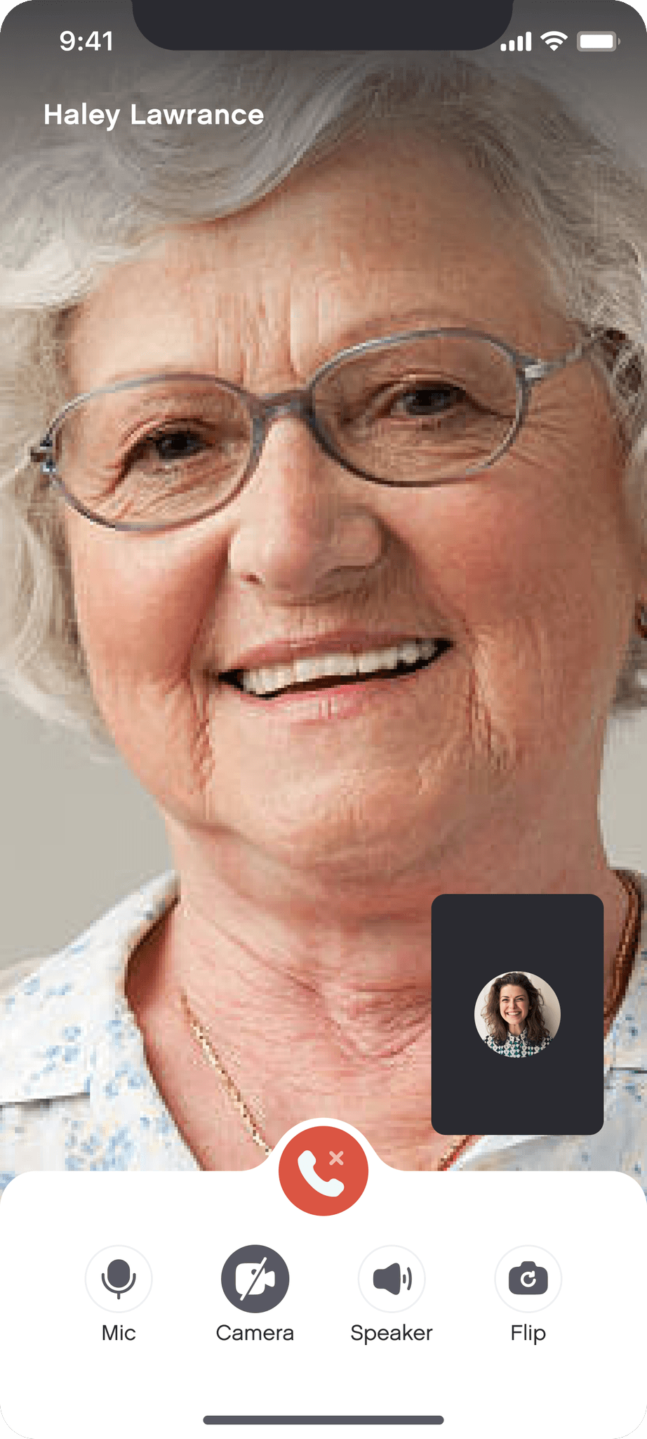
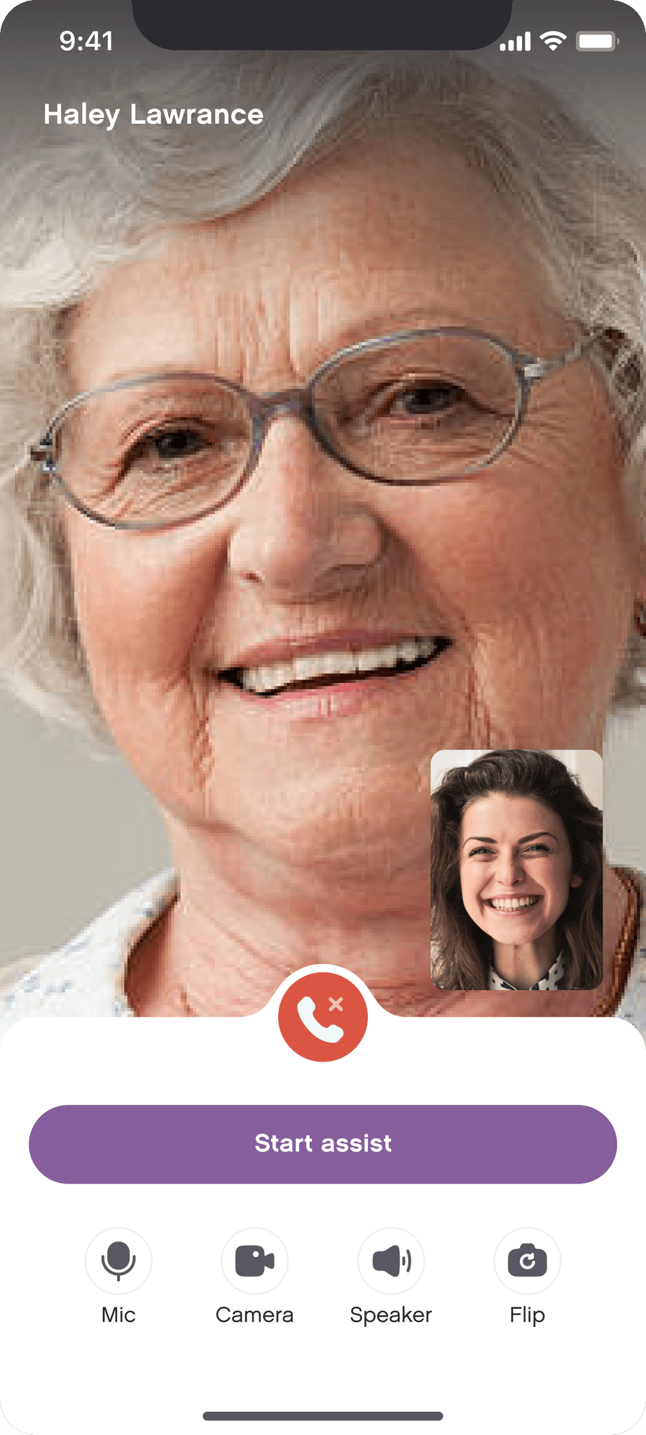
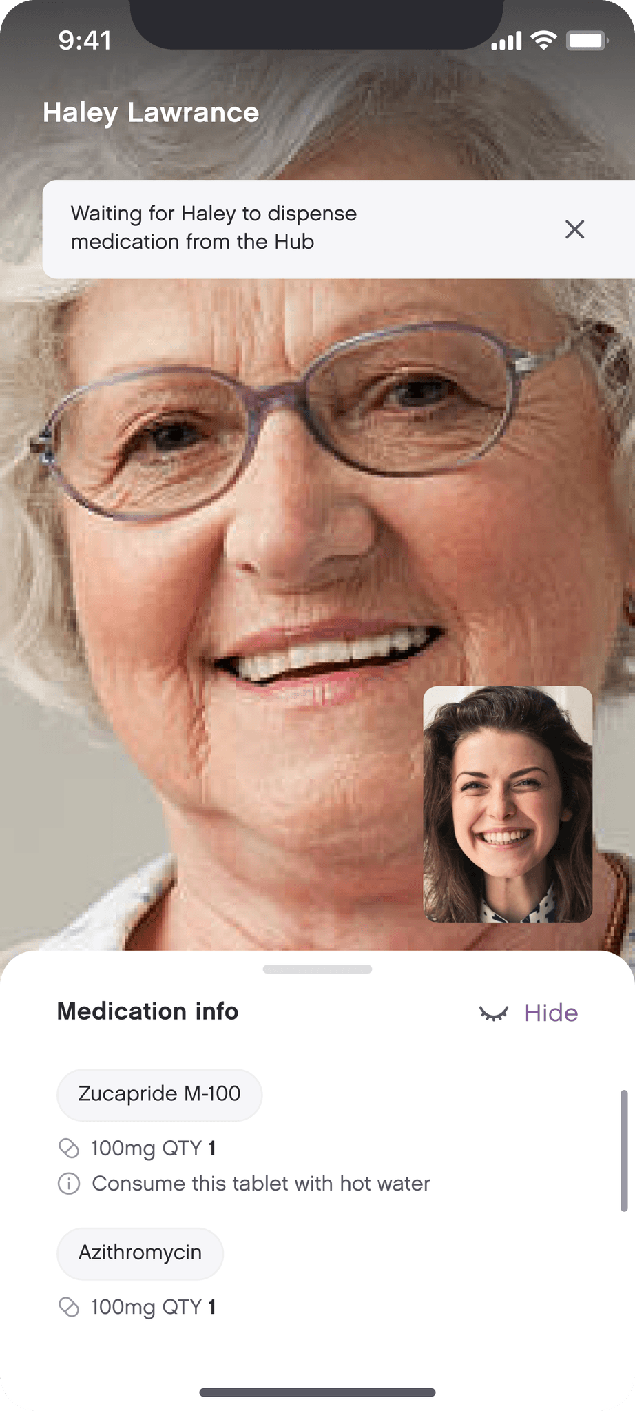
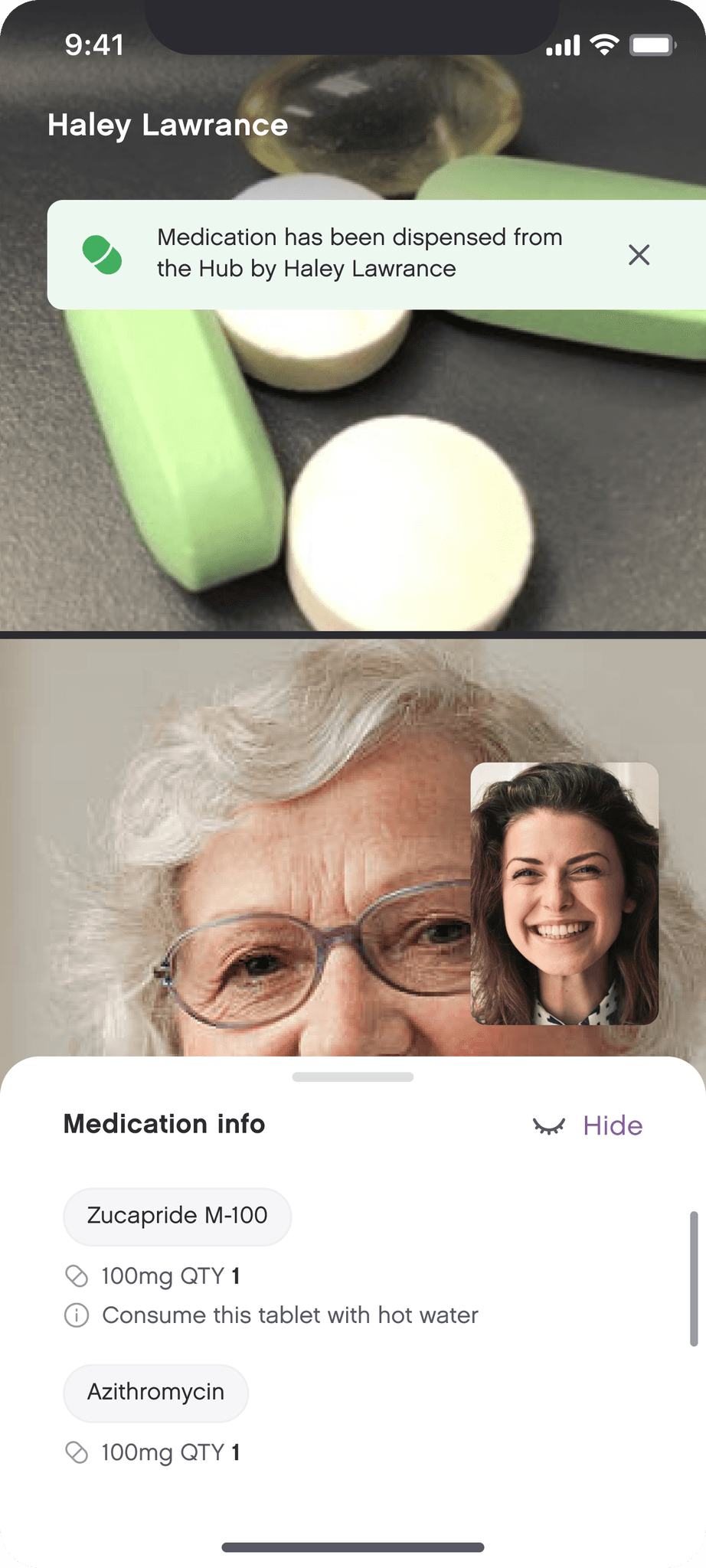
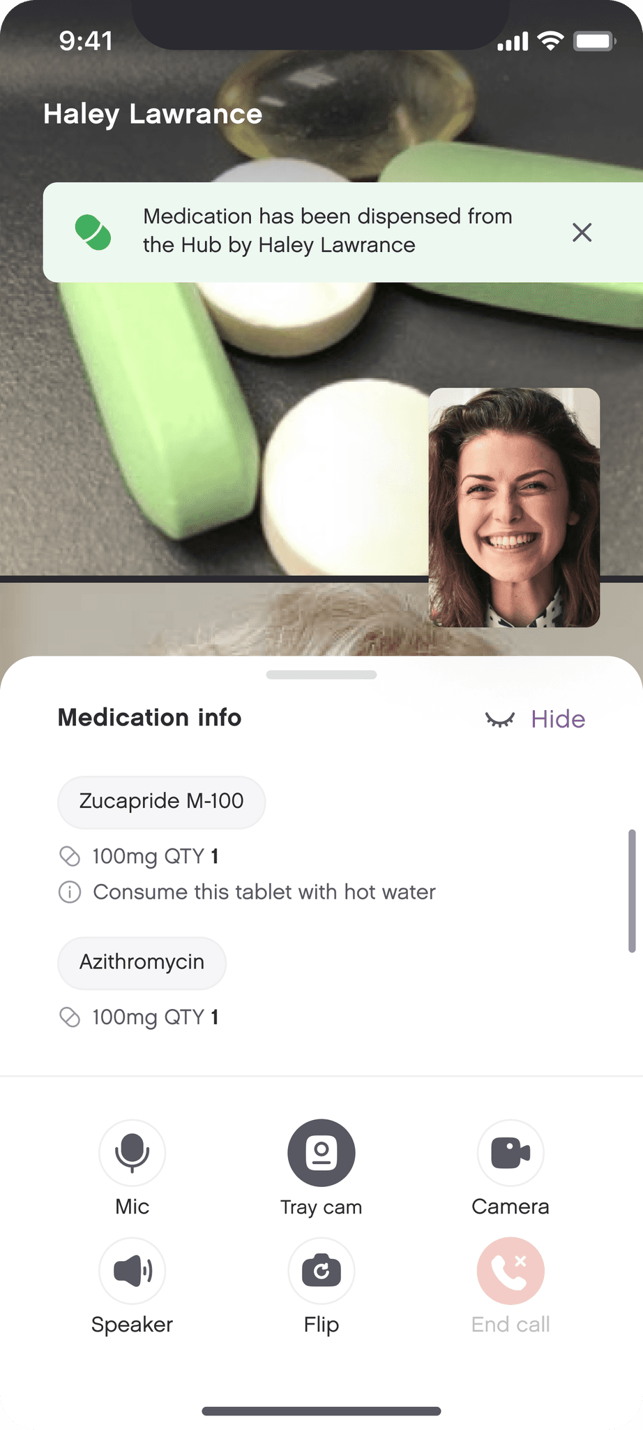
Enhancing the Video Calling Experience: Streamlining Information Overload
When the medication is dispensed by the device under the supervision of a caregiver / admin through video call, there is a lot of information on the screen along with the basic call actions. The information is mostly about medicines due, medicines taken, medicines missed and notes / description about the medicines. On top of that, you can also access the 'medicine tray cam' (installed on the device) view to check if the has elderly missed taking any medicine that has been dispensed.
Showing all this information on a single screen during a video call was a big task. We came up with a layout keeping in mind the information hierarchy - categorizing information into what is the most crucial piece and what follows. Our goal was to make the video calling experience seamless for the users so we kept the less important information under collapsed sections to reduce the cognitive load but at the same time making sure that nothing loses it's discoverability.